
Visualize Data Effectively in Sheets
Effective data visualization can transform raw numbers into compelling stories, guiding audiences to deeper insights and informed decisions. In a world inundated with data, mastering the art of visual representation is not just beneficial; it's essential.
Key Takeaways
- Visual data representation clarifies complex information, making it accessible and engaging for audiences.
- Google Sheets provides user-friendly tools for creating a variety of charts, enhancing collaboration and accessibility.
- Choosing the right chart type is crucial; line charts for trends, bar charts for comparisons, and pie charts for proportions.
- Customizing chart titles, labels, and axes improves clarity and helps prevent misinterpretation of data.
- Incorporating data labels enhances understanding by providing precise information at a glance.
- Utilizing colors and fonts thoughtfully can improve visual accessibility and engagement.
- Continuous learning through tutorials and community forums can elevate your data visualization skills.
Understanding the Importance of Visual Data Representation in Google Sheets
Visual data representation is crucial for conveying information clearly and effectively. When we use charts and graphs, we can present complex data in a way that is easy to understand. This helps audiences grasp key insights quickly, making it a vital skill when working with data in Google Sheets.
Moreover, visualizations can enhance decision-making processes by highlighting trends and patterns. Instead of sifting through endless rows of numbers, we can summarize our findings and present them visually. This makes our reports and presentations much more engaging and informative!
The Role of Data Visualization in Effective Communication
Data visualization plays a significant role in effective communication. It transforms boring data into engaging visuals, which can tell a story at a glance. By using visuals, we can emphasize important points and guide our audience through our data analysis.
- It makes complex information more accessible.
- Visuals can highlight trends and outliers.
- Engaging graphics can keep the audience interested.
This ability to make data understandable not only aids in communication but also fosters better collaborations among team members. When we share visual data, we enhance clarity and ensure that everyone is on the same page. For more detailed strategies on enhancing your collaborative efforts using Google Sheets, check out our post on collaborating in Google Sheets.
Benefits of Using Google Sheets for Data Visualization
Google Sheets offers numerous benefits for data visualization. First and foremost, it's a user-friendly tool that allows us to create professional-looking charts with just a few clicks. The platform supports various chart types, which means we can choose the best one for our data effortlessly.
- Access from anywhere with an internet connection.
- Easy sharing and collaboration with others.
- Integration with other Google Workspace tools.
Additionally, Google Sheets allows for real-time collaboration, meaning multiple users can work on the same document simultaneously. This feature enhances teamwork and speeds up the data analysis process, making it a go-to choice for many businesses when visualizing data. To learn more about effective organizing of your data in Google Sheets, visit our guide on organizing data effectively.
Creating and Customizing Charts in Google Sheets
Creating and customizing charts in Google Sheets is an exciting way to visualize data effectively. Knowing how to select the right data and insert the appropriate charts can make all the difference in our presentations. By taking advantage of Google Sheets' features, we can create impactful visualizations that capture our audience’s attention!
It's essential to choose the right chart type based on the data we have. For example, line charts work well for trends, while bar charts are great for comparing categories. Understanding these basics will help us communicate our data more effectively and enhance our storytelling abilities.
Selecting Data and Inserting the Right Charts
Selecting data properly is the first step in creating informative charts. We should highlight the data range we want to visualize before inserting a chart. Google Sheets will then provide us with a range of chart options based on our selected data.
- Highlight the data range you want to include.
- Click on the “Insert” menu.
- Select “Chart” to view chart options.
Once we've chosen a chart type, we can further customize it to meet our needs. This is where the real fun begins, as we can adjust colors, fonts, and formats to make our charts visually appealing!
Identifying Suitable Chart Types for Your Data
Choosing the right chart type is crucial for effective data visualization. Every type of chart has its strengths, and selecting the suitable one can enhance our message. For example, a pie chart is ideal for showing proportions, while a bar chart is perfect for comparing quantities across different categories.
- Line charts for trends over time.
- Bar charts for comparing different groups.
- Scatter plots to show relationships between two variables.
By understanding the characteristics of various chart types, we can make informed decisions that lead to better data representation. This ensures our audience can quickly grasp the information we want to convey!
Step-by-Step Guide to Inserting Charts in Google Sheets
Inserting charts in Google Sheets is straightforward. Follow these simple steps to get started:
- Select the data you want to visualize.
- Go to the “Insert” menu in the toolbar.
- Click on “Chart” from the drop-down list.
- Choose your preferred chart type from the Chart Editor.
After inserting the chart, you can customize it to match your style and preferences. This flexibility allows us to create visuals that not only convey information but also look great!
Customizing Chart Types, Titles, and Axes for Better Clarity
Customizing our charts is key to making them clear and effective. By adjusting chart types, titles, and axes, we can improve our audience's understanding of the data presented. A well-labeled chart provides context, helping viewers grasp the information quickly.
One way to enhance clarity is by crafting precise and descriptive chart titles. This helps the audience know what the chart is about at first glance. Furthermore, selecting the correct axes ensures that the data is represented accurately, avoiding any potential misinterpretation!
Adjusting Chart Titles and Labels for User-Friendliness
Chart titles and labels should be straightforward and informative. A good title summarizes the main idea of the chart, providing context for the viewer. Additionally, labels on axes should clearly define what is being measured.
- Use clear and concise language.
- Ensure titles reflect the content of the chart.
- Label axes with units of measurement if applicable.
By paying attention to these details, we can make our charts user-friendly and ensure our audience can easily interpret the data.
Choosing the Right Axes for Accurate Data Representation
When it comes to axes, selecting the right scale is essential for accurate data representation. A well-scaled axis can prevent misleading interpretations of the data. For example, starting the Y-axis at zero can provide a more honest view of the data's magnitude!
- Consider the range of your data.
- Use consistent intervals for the axes.
- Opt for a logarithmic scale if necessary for large ranges.
Taking the time to choose appropriate axes will lead to a more informative and visually appealing chart. This attention to detail can make our data presentation stand out and resonate with our audience.
Utilizing Data Labels for Enhanced Chart Understanding
Data labels are another essential component of effective chart customization. By including data labels, we provide precise information at a glance. This helps viewers quickly understand the values associated with each point on our charts.
- Include labels for key data points.
- Keep labels concise to avoid clutter.
- Make sure labels are easy to read.
Utilizing data labels thoughtfully can greatly enhance the clarity of our visualizations, making our charts even more informative! This small adjustment can significantly improve how our audience interacts with our data.
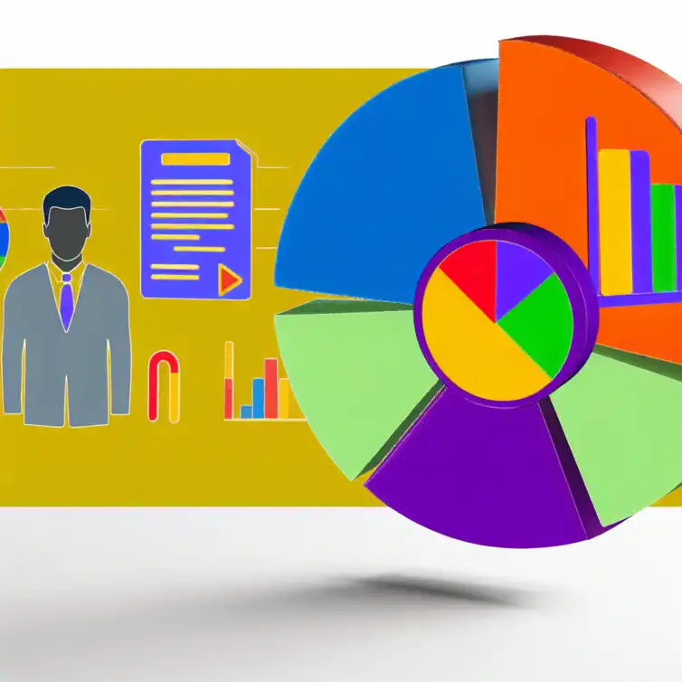
Key Strategies for Effective Data Representation
This visual highlights essential tips for creating impactful visuals in Google Sheets, focusing on chart types, customization, and clarity.
Chart Types
- Line Charts: Trends over time
- Bar Charts: Comparing different groups
- Pie Charts: Showing proportions
- Scatter Plots: Relationships between variables
Customization Tips
- Clear titles and labels
- Appropriate axis scaling
- Use of colors for accessibility
- Data labels for clarity
Benefits of Visualization
- Enhanced decision-making
- Improved audience engagement
- Greater data accessibility
- Clarity in communication
Quick Summary
Here's a brief recap of the key points discussed so far:
- Visual data representation enhances clarity and decision-making.
- Choosing the right chart type is crucial for effective communication.
- Customization of charts, titles, and axes improves user understanding.
- Google Sheets offers user-friendly tools for creating impactful visuals.
Summarizing Key Strategies for Effective Data Representation
When it comes to visual data representation in Google Sheets, a few key strategies can make all the difference. It's important to revisit the methods we've discussed, as they can help you present your data in the most effective way possible. Using the right chart types, customizing titles and labels, and improving legibility are all vital steps in creating visuals that are not only informative but also engaging!
By focusing on the visual aspects of your data, such as chart size, colors, and readability, you can drastically enhance the impact of your presentations. Remember, well-designed visuals can transform raw numbers into compelling stories that resonate with your audience. With these strategies in mind, you're well on your way to mastering data visualization in Google Sheets!
Recap of Essential Google Sheets Tips for Visual Data Representation
To recap, here are some essential tips for achieving effective data representation in Google Sheets:
- Select the appropriate chart type based on your data.
- Customize chart titles and axes for clarity.
- Utilize colors and fonts that enhance accessibility.
- Incorporate gridlines and legends to improve understanding.
- Consider advanced chart types for more complex data sets.
These tips can guide you in creating visuals that convey your message clearly. Remember, the goal is to make your data not just visible, but also understandable and visually appealing!
The Impact of Well-Designed Visuals on Data Interpretation
Well-designed visuals play a crucial role in how data is interpreted. When visuals are clear and engaging, they help audiences grasp complex information more easily. Additionally, good visuals can highlight trends and patterns that might otherwise go unnoticed.
Furthermore, effective data visualization can lead to more informed decision-making in any business or project. By presenting your data in a visually compelling way, you can encourage your audience to dig deeper and engage with the content more thoughtfully. In essence, visual data representation isn't just about aesthetics—it's about making your data work harder for you!
Encouraging Further Learning and Exploration
As you dive deeper into the world of data visualization, it's essential to continue learning and exploring new techniques. There are countless resources available that can help you expand your knowledge and improve your skills in using Google Sheets for visual data representation.
Taking the time to explore these resources will not only strengthen your understanding of the tools at your disposal but also inspire you to implement innovative strategies in your projects. Embrace the journey of learning, as it's a key part of mastering data visualization!
Resources for Deepening Your Knowledge in Data Visualization
Here are some valuable resources you can use to enhance your data visualization skills:
- Online tutorials and courses on platforms like Coursera and Udemy.
- Google's own help and support pages for Sheets.
- Community forums like Reddit or Stack Overflow for real-world advice.
- Books focused on data visualization principles and best practices.
- Webinars and workshops that focus specifically on Google Sheets.
Utilizing these resources can elevate your understanding and application of data visualization techniques, making you more proficient in Google Sheets!
Call to Action: Start Implementing These Tips in Your Google Sheets Projects
Now that you have the knowledge and resources, it's time to put these tips into action! Start by reviewing your current projects and identifying areas for improvement in your data visuals. Experiment with different chart types and customizations to see what works best for your data.
Don't hesitate to share your visuals with others for feedback. Engaging with your peers can lead to valuable insights and ideas for further improvement. Remember, the more you practice, the better you will become at creating effective data representations!
Utilizing Tutorials and Community Forums for Continuous Learning
One of the best ways to improve your skills is to engage in continuous learning. Tutorials can provide structured guidance, while community forums offer a platform for sharing experiences and challenges. By participating in discussions and asking questions, you can gain insights that might not be available through traditional learning methods.
Moreover, don’t overlook the value of networking with others who share your interest in data visualization. Whether through social media groups or local meetups, connecting with like-minded individuals can spark new ideas and keep you motivated. Stay curious and keep exploring—there's always something new to learn in the realm of data visualization!
Recap of Key Points
Here is a quick recap of the important points discussed in the article:
- Visual data representation is essential for clear and effective communication of complex information.
- Using charts and graphs helps highlight trends and patterns, aiding decision-making processes.
- Google Sheets is a user-friendly tool providing various chart types suitable for different data sets.
- Choosing the right chart type enhances storytelling and ensures effective data representation.
- Customizing chart titles, labels, and axes improves clarity and user-friendliness.
- Utilizing data labels can enhance understanding of the visualized data.
- Continuous learning through resources and community engagement is vital for mastering data visualization.
Frequently Asked Questions (FAQs)
- What is the importance of visual data representation? Visual data representation is crucial for conveying complex information clearly and effectively, helping audiences grasp key insights quickly.
- How can Google Sheets assist in data visualization? Google Sheets provides user-friendly tools for creating various chart types, enhancing accessibility and collaboration.
- What are the key factors in choosing the right chart type? The key factors include the nature of your data, the story you want to tell, and the comparisons you wish to highlight.
- Why is customization important for charts? Customization improves clarity, enhances user-friendliness, and helps prevent misinterpretation of the data.
- How can I improve my data visualization skills? Continuous learning through tutorials, community forums, and hands-on practice can enhance your data visualization skills.


Class Schedule Templates in Sheets
Integrating Google Sheets with Tools
Track Your Influencer Campaigns Easily
Installing Google Sheets Add-ons Guide
Conditional Functions in Google Sheets